Illustrations
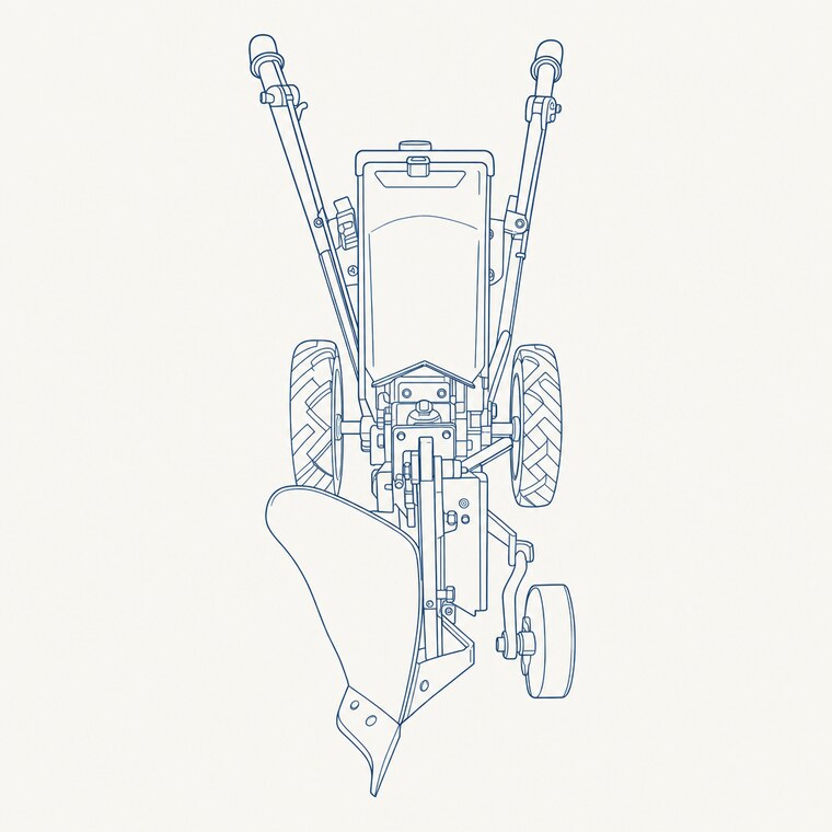
An illustration is a cover style pointed inward. It prints in a single ink — the interior print law, of which a full-colour cover is the one exception — carries no lettering, and lands as a plate: a figure the build sets into the text and lists in the plates. You draw it from a subject, or from source material you supply — a photograph you took, a rough map, a sketch — redrawn into the book’s own hand. Each sample below is a different subject in a different ink, to show the range a medium covers; a real book prints all of its plates in its own single ink.
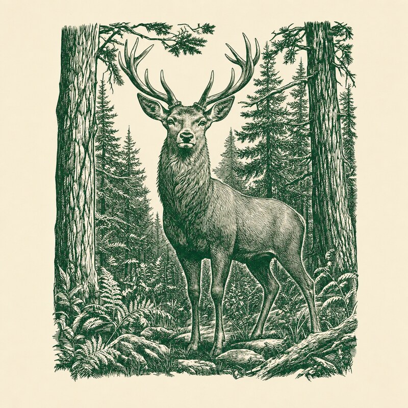
wood-engraving
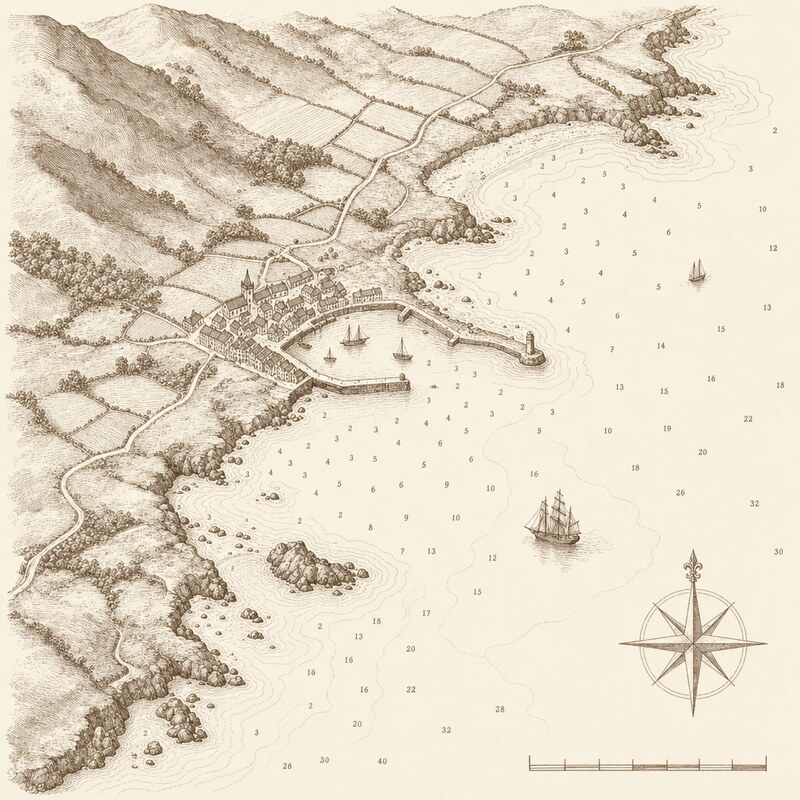
engraved-map
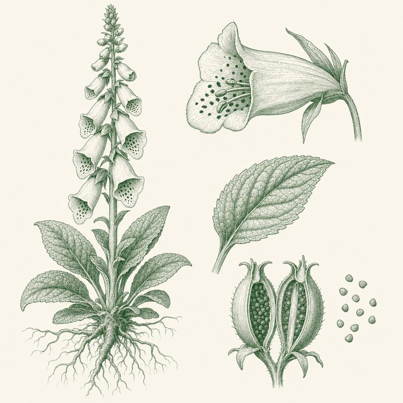
botanical-plate
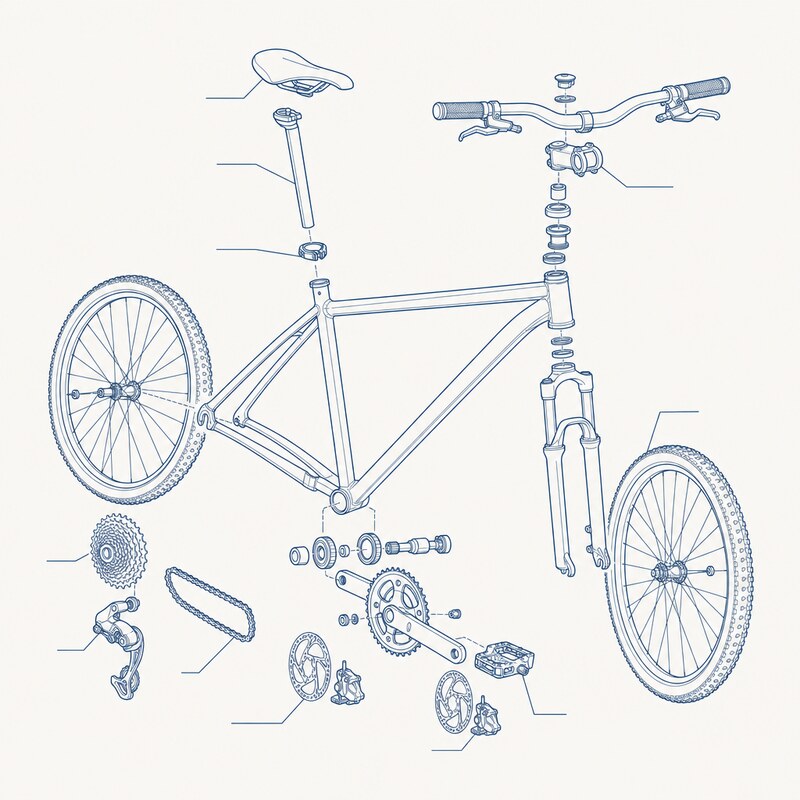
line-diagram
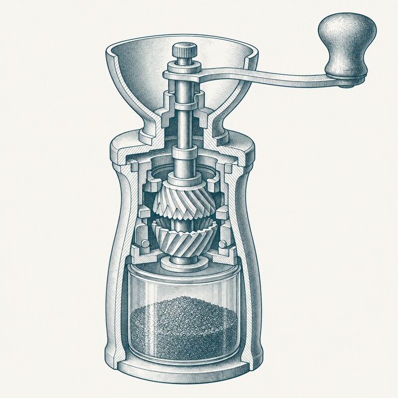
technical-cutaway
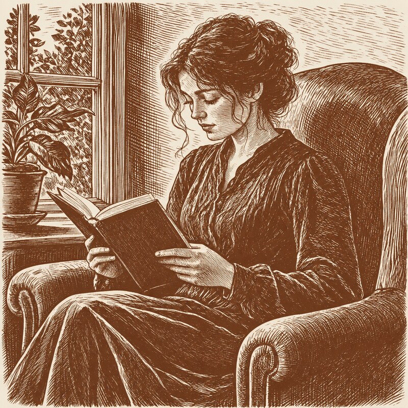
figure-from-photo
ornament
The subject comes from the manuscript, not the caption
A caption is a reader-facing label; it is not art
direction. So the picture is drawn from a separate
art: description you write beside the
figure in the manuscript — the kind on the image, the direction
in the comment that follows it:
{.plate style=wood-engraving}
<!-- art: a compositor's left hand holding a brass composing stick, thumb setting
the measure; type in the case behind; 19th-c workshop, high contrast line,
no lettering -->Then name the figure — the image file’s stem — and the press reads
that description as the prompt and the style= as the
style:
press illustrate compositor            # reads the manuscript's art: for it
press illustrate --list
A figure with no art: description is not
drawn — the press refuses rather than fall back to the
caption’s own words (which is exactly what produced literal, silly
plates). A .chart or .diagram is
routed away from the image model: those render from a
data file. Run press figures to see every declared figure
as JSON — its kind, style, art: description, and whether it
is generatable — the same authoritative reading the art-direction
workflow uses.
You can still direct one straight from the command line with
--subject (that is your art direction, not a caption), and
redraw source material with --from:
press illustrate limpet --style wood-engraving --subject "a limpet on a wet rock"
press illustrate coast-map --style engraved-map --from maps/rough-sketch.png
press illustrate writes the art to
build/illustrations/ and prints the one command that
installs it —
press art accept build/illustrations/<name>.png --as plate:<name>
— the same intake every plate passes through, which greys it to
the single interior ink, keys its light ground out to
transparency (so the graphic composites onto any surface, not a
baked-white box), and records it. A book’s default style comes from
config/aesthetic.yaml
(plates: {style: wood-engraving}); the figure’s
style= and --style override it. With no
image-model key set, press illustrate prints the prompt
instead, so the press stays offline by default.
Source material
The strongest illustrations start from something real. Give
press illustrate a photograph or a map with
--from, and the style redraws it — keeping the composition,
changing the medium:
press illustrate harbour --style figure-from-photo --from photos/harbour.jpg
press illustrate parish --style engraved-map --from maps/ordnance.png
Your snapshot becomes a wood engraving that belongs in the book; a
real map becomes an engraved map in the book’s ink. The
figure-from-photo style needs a --from; every
other style accepts one and will lean on it.
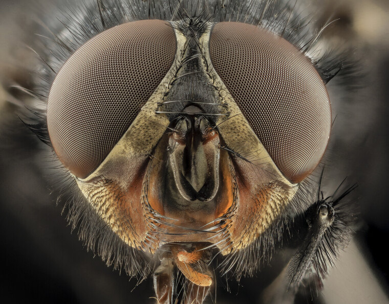
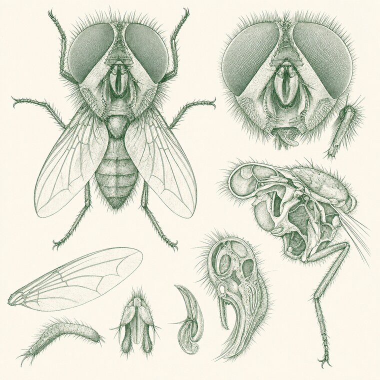
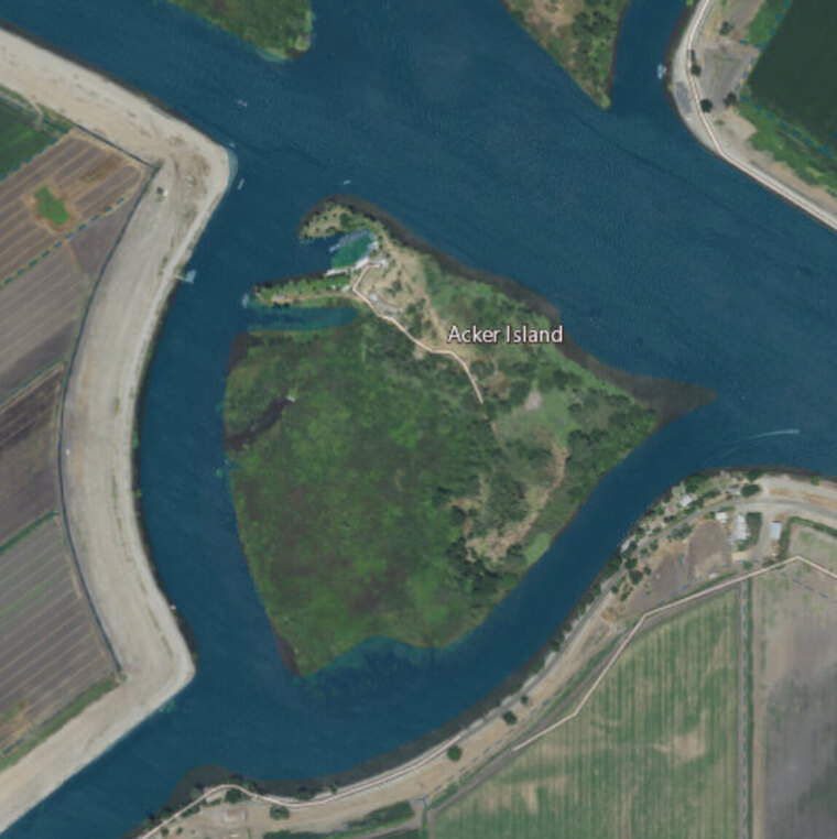
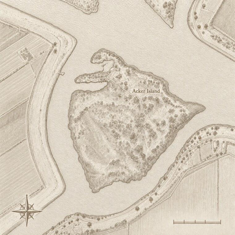
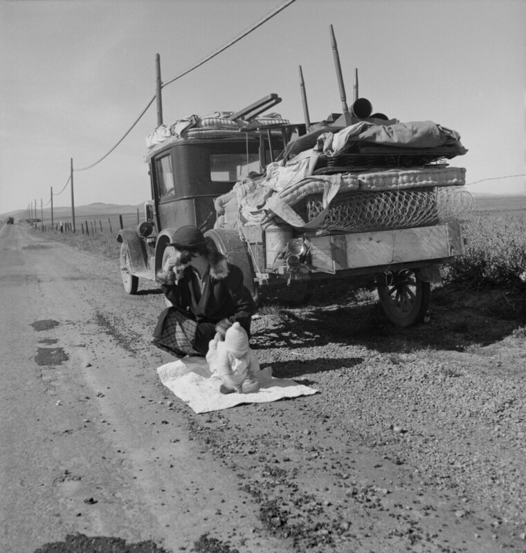
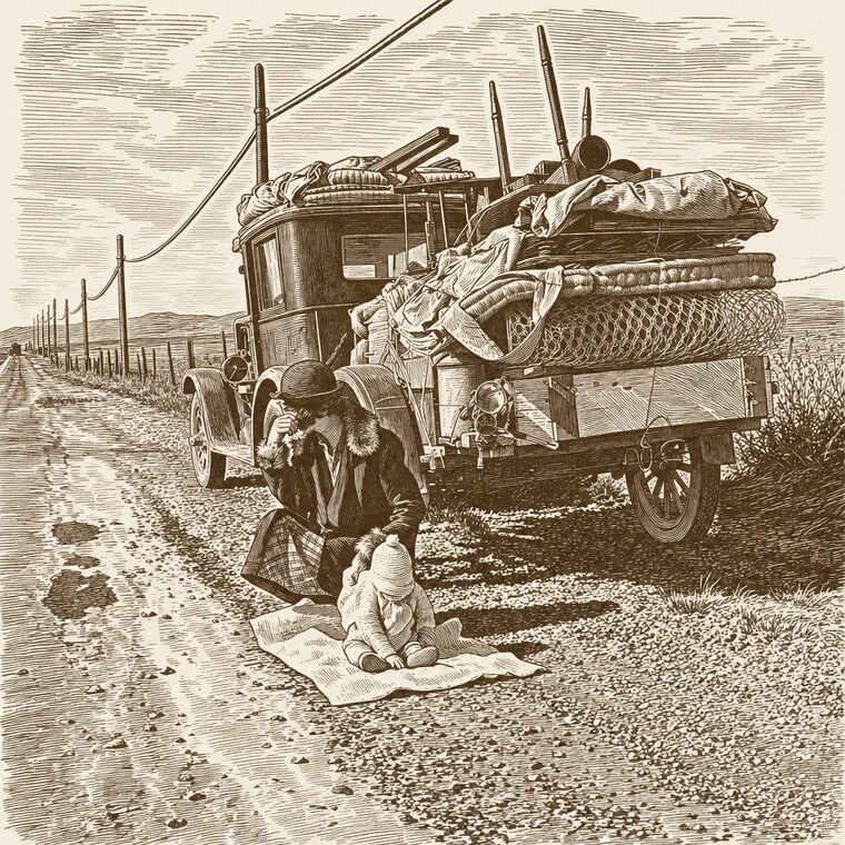
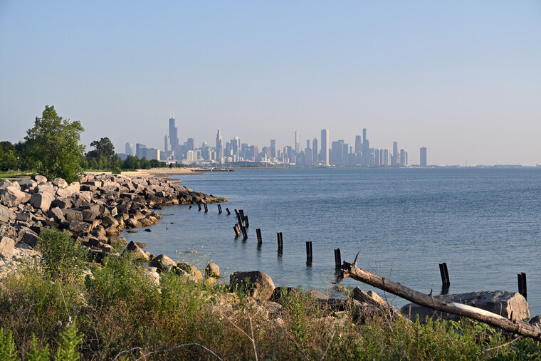
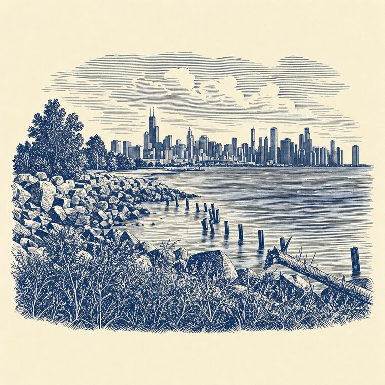
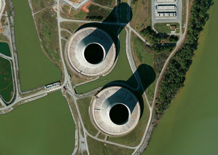
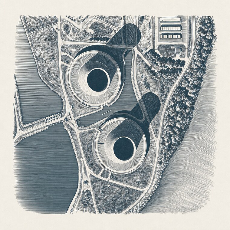
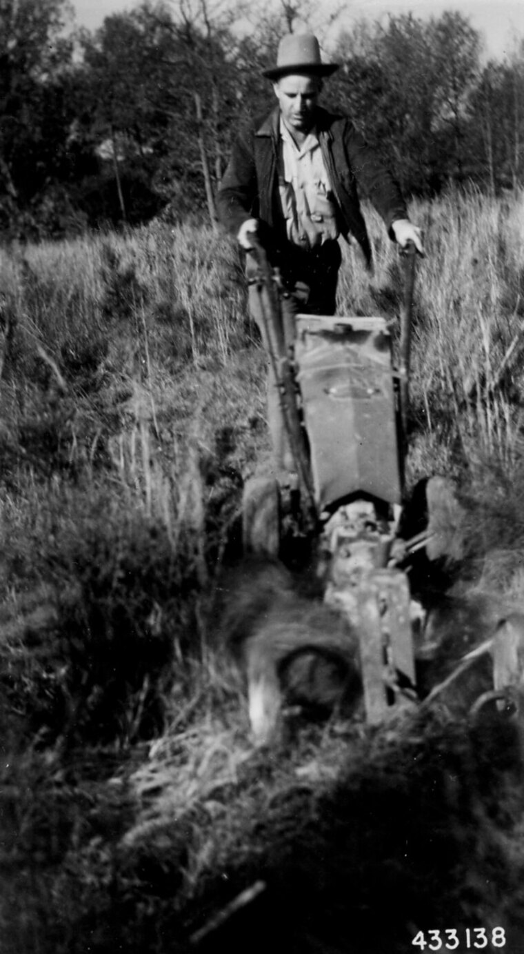
Each pair below is a real, public-domain photograph and the plate the engine drew from it — the composition kept, the medium and the ink the book’s:
Numbered figures, cross-references, and the two lists
A plate is the literary woodcut idiom: unnumbered,
quiet, and collected in the List of Plates. A bare
 image is a plate too, so a book that declares
nothing new typesets exactly as before.
An informative figure is different. Declare an
explicit kind — .figure, .chart,
.map, .photo, or .diagram — and
the press numbers it by chapter (“Figure 3.2”),
collects it in a separate List of Figures, and gives it
a cross-reference target. Give it an #id and refer to it
from anywhere with @id; the reference resolves to a linked
“Figure 3.2”, the same number in every format:
As @fig:press shows, the platen does the pressing.
{#fig:press .figure
width=half-measure fig-alt="A hand press, the platen raised over a sheet"}A mixed book prints both lists; a book with only plates prints only the List of Plates, byte-for-byte as before. Plates are never numbered.
Placing a figure: relative and parity-aware
Where and how a figure sits rides on its image attributes, in a vocabulary that is relative, never absolute, so one manuscript typesets on any trim:
| attribute | values | meaning |
|---|---|---|
width |
full-measure, half-measure,
third-measure |
width against the line (in-flow figures only) |
place |
inline, wrap-inner,
wrap-outer, plate, frontispiece,
full-bleed, margin |
where it sits; wrap runs text around the parity-aware side (never left/right) |
outset |
a length in em (default 1em) |
the runaround gap — the book-trade term, not “standoff” |
fig-alt |
text | the accessible alt text — a fourth field, distinct
from the visible caption, the art: prompt, and any credit
line |
decorative |
true |
an ornament: empty alt, never numbered |
press check refuses a malformed placement before any
render: an absolute width where a measure belongs, a
left/right side (use wrap-inner /
wrap-outer), an out-of-vocabulary place, a
non-em outset, a measure on a plate, or a
decorative image that still carries
fig-alt.
On a real page
Before the pieces in isolation, here is the vocabulary at work on real pages from a build — dense running prose with figures worked in the way a manual actually sets them, several to a spread. This is the scale to judge a placement at; the sections that follow take each behaviour apart on its own.
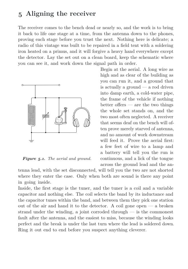
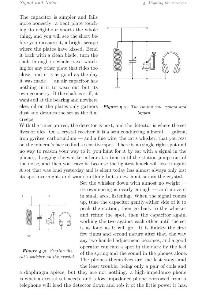
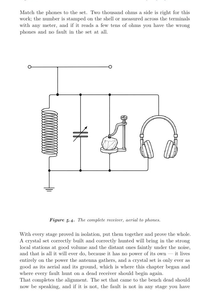
What each placement produces
Each card shows the exact attributes you write and the leaf the press
typeset from them, drawn from the signal-and-noise example. (Give every real
figure a fig-alt as well; it is elided here to keep the
placement attributes in view.)
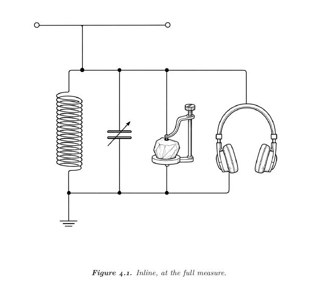
place=inline
{.figure
width=full-measure place=inline}Runs the figure in the text column at the chosen measure, its caption beneath — what a bare image already does, made explicit.
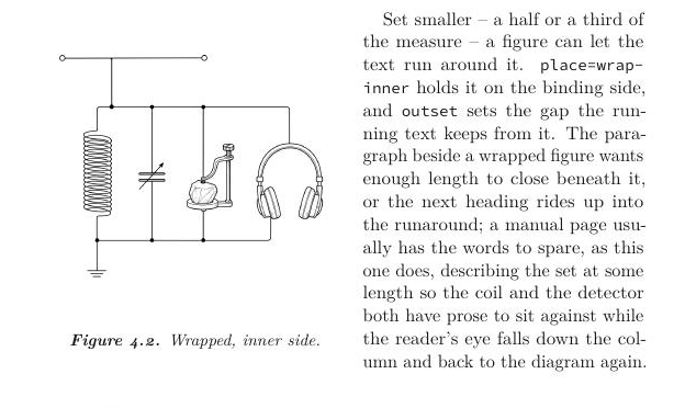
place=wrap-inner
{.figure
width=half-measure place=wrap-inner outset=1em}Sets the figure on the binding-aware inner side and runs the text around it; outset is the runaround gap. On a recto the figure sits left; on a verso, right — the press works it out from the page parity.
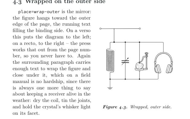
place=wrap-outer
{.figure
width=half-measure place=wrap-outer outset=1em}The mirror of wrap-inner: the figure hangs toward the outer edge, the running text filling the binding side.
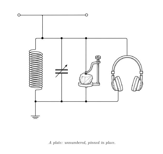
place=plate
{.plate place=plate}The literary woodcut idiom: an unnumbered figure with a quiet italic caption and no “Figure N.”. A bare  with no declared kind is a plate too, so this is the house default.
place=full-bleed
{.figure place=full-bleed}Gives the figure its own cleared leaf and fills it — never a floating figure that defers a page late — with the caption on the same leaf.
place=frontispiece
{.figure place=frontispiece}Like full-bleed, but clears to the verso so the plate faces the next chapter's opening recto across the gutter.
The press will not let a placement strand your text. A
wrap that would begin too low on a page — with too few
lines left to close beneath the figure — moves whole to the next page
rather than hang off the foot; the guard is sized to the figure, so a
taller figure reserves more room. A full-bleed or
frontispiece takes a cleared leaf, not a
floating figure that LaTeX would defer a page late and leave a blank
behind, and its caption sits on the same leaf. A
numbered figure carries its own bold “Figure C.N.” set
by the house, so no stray label — or the asterisk a bare
\caption* once leaked — reaches the caption.
Placement is a print concern. On the reflowable web — EPUB and the reader — a placed figure becomes a clean in-flow figure, and the markdown and plain-text editions keep it in flow too; none of the placement scaffolding leaks into them.
How the measure changes each placement
width is relative — full-measure,
half-measure, third-measure, never inches — so
one manuscript holds on any trim. An inline figure (and a
plate) sits at that width, centred in the column. A
wrap spends the width on the figure’s own column, so
what visibly changes is the text column beside it: the narrower
the figure, the wider — and shorter — the runaround. A
full-bleed or frontispiece ignores
width (it fills its leaf), and a full-measure
wrap leaves no room for text beside it, so a wrap takes a half or a
third.
place=inline (and plate): the figure sits at the measure, centred in the column.
width=full-measure
width=half-measure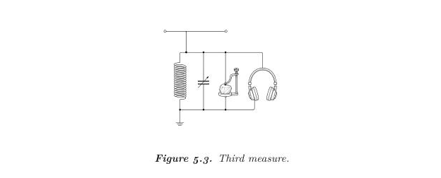
width=third-measureplace=wrap-inner / wrap-outer: the measure sizes the figure column, so the text column widens as the figure shrinks.
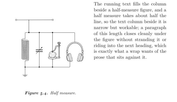
width=half-measure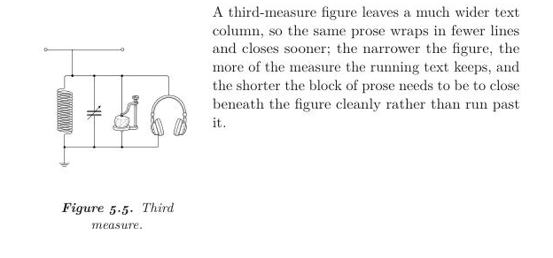
width=third-measureHow a wrap behaves against running text
A wrap is not a fixed box; it is a runaround, and how it reads depends on the prose beside it. These are full pages from a build, so you can see the behaviour at the scale a reader meets it — how a long paragraph closes under the figure, what a short one leaves open, where later paragraphs draw, and what the house does when a figure is declared too near the foot of a page.
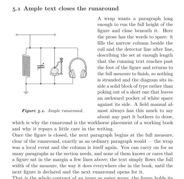
Ample text closes the runaround
Give a wrap a paragraph long enough to run the figure's height and it closes cleanly; once the figure ends the text returns to the full measure, and later paragraphs set as ordinary prose.
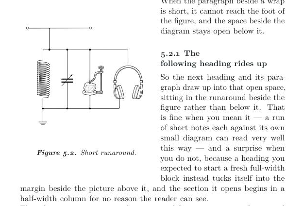
Short text: the next block rides up
When the paragraph beside a wrap is too short to reach the figure's foot, the next heading or paragraph draws up into the space still open beside it rather than starting fresh below. Feed the wrap more prose for a clean break.
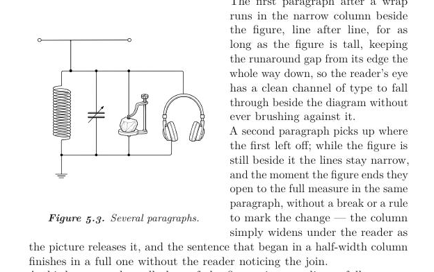
Where later paragraphs draw
The first paragraphs run narrow beside the figure; the moment it ends the text opens to the full measure in the same paragraph, and everything downstream is ordinary full-width prose again — a wrap costs only its own height, in its own margin.
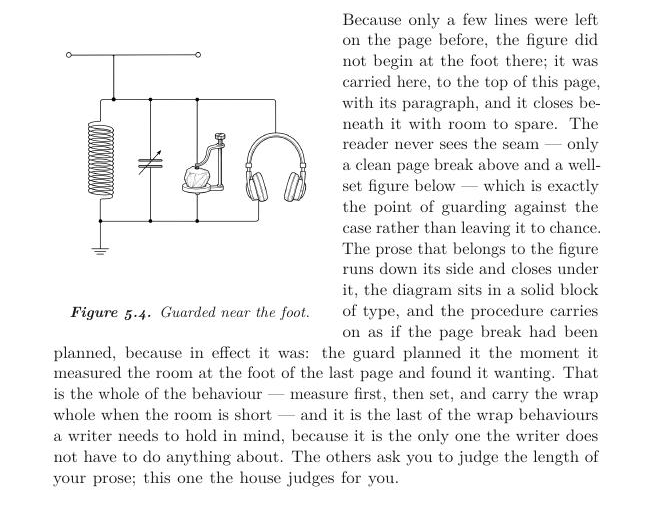
Near a page foot: the guard carries the whole wrap over
When fewer lines remain than the figure is tall, the whole wrap — figure and paragraph together — is carried to the top of the next page rather than stranded at the foot with no room to close. The page above keeps a little quiet space; the reader never sees a broken runaround.
What does not belong here
Data figures — bar charts, line graphs — are not
illustrations. An image model would invent the numbers. Chart a
real data file, rendered exactly, in the book’s palette; keep
press illustrate for illustrative art. (The data-figure
path is the natural next step for this system.)
Building your own
Add config/illustration-styles.yaml to your book with
the same shape as the house library, and your styles merge over it:
styles:
  my-plate:
    name: "My plate"
    note: "what it looks like, in a line"
    source: required     # optional: this style only makes sense with --from
    prompt: |
      A plate of {subject}, drawn as ... in {ink} on {paper}.
A template may use {subject}, {ink} (your
interior ink), and {paper}; the press adds the wordless,
single-ink guardrail. Then
press illustrate fig1 --style my-plate.
Finishing a plate for print and web
A commissioned plate is a modest raster; the print interior wants it
large and crisp, the reader wants it small and clean.
press art enhance does both in three stages matched to the
art’s own grain:
press art enhance                         # finish every plate under assets/woodcuts/
press art enhance assets/woodcuts/shop.png # or just one- Upscale through a Real-ESRGAN model chosen for the
medium in
config/aesthetic.yaml– a line model (remacri) for an engraving, which keeps the hatching crisp instead of inventing the smooth gradients a photo model would. The upscaler is an external tool, detected not bundled: install Upscayl or a standalonerealesrgan-ncnn-vulkanandpress doctorwill report it. The CI toolchain image bakes it in (therealesrgan-ncnn-vulkanCLI with the remacri and ultrasharp models), so a build in the container upscales too – on amd64, where CPU inference runs against a software Vulkan device; the arm64 image has no upstream binary and resamples. Absent an upscaler the command still runs – it resamples instead of upscaling, so the rest of the win lands. - Resample to a print-grade long edge (2400px by
default;
--max-edge). - Quantize to a small palette (
--colors, default from the medium) and write a lossless PNG. An engraving is a few grays, so this is visually lossless and turns a multi-megabyte truecolor image into a small one – small enough that a plate ships as a lossless PNG rather than a lossy JPEG.
Finishing keeps a master’s alpha, so the mask survives to the reader edition.
One master, every surface
A plate is kept as an alpha PNG master — the ink on
transparency, the light ground keyed out — so one graphic composites
onto any surface instead of carrying a white box around it.
press art accept does the keying: ink-on-white line art is
trivially separable by a luminance key, and a plate that arrives already
on transparency keeps its mask. From that one master:
- the print interior flattens it onto white at build time (no transparency and no over-resolution reach the vendor’s preflight);
- a cloth cover would flatten it onto the field colour, so the ink sits on the cloth with no box (this is how the imprint logo already lands);
- the reader edition serves the transparent PNG, so a plate reads cleanly on a white or a dark page.
You never hand-ship a baked-white master; if you do, the intake segments it rather than shipping it opaque.